Search, Discovery, and Getting It Right Before Launch.
Launch was approaching. The UChicagoNode platform didn't feel ready, but instinct alone isn't enough to delay a launch date.
A pre-launch study paused the launch, and reshaped the roadmap.
feeling isn't evidence — now what?
TIMELINE:
Feb – Apr 2026
ROLE:
UX Designer: Sole Design Contributor
TEAM:
5 Metadata Specialists, 1 PM, 2 Developers, Director
OUTCOME:
Critical issues identified and resolved.
Context:
A pre-launch study that reshaped the roadmap.
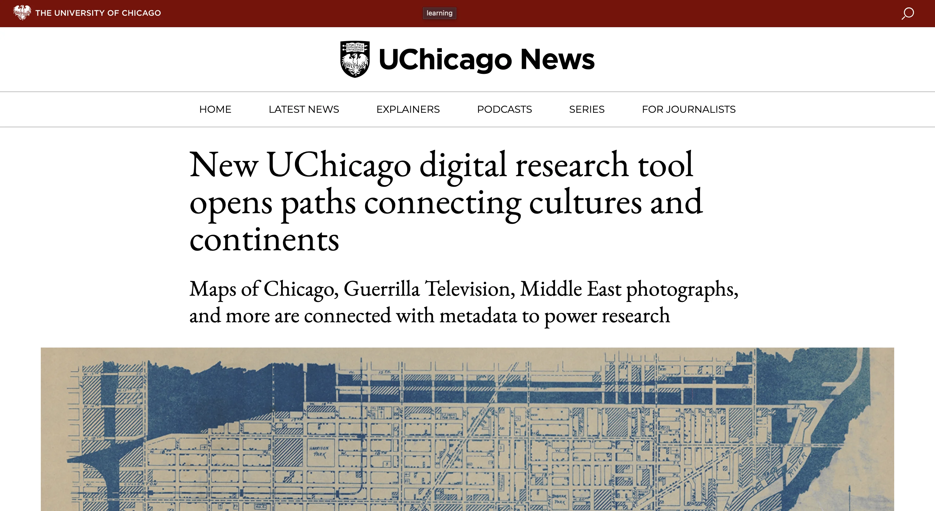
UChicagoNode is a unified digital collections platform for the University of Chicago Library. With launch approaching, something felt off, the platform didn't feel ready for the 120,000+ researchers, librarians, and students who would use it. But instinct alone wasn't enough to push back on a launch date. Evidence was. That's why I proposed a targeted pre-launch study, to find out if what I was sensing was actually there.
Problem:
what was the problem?
Process:
1. survey.
designed and shipped in under a week.
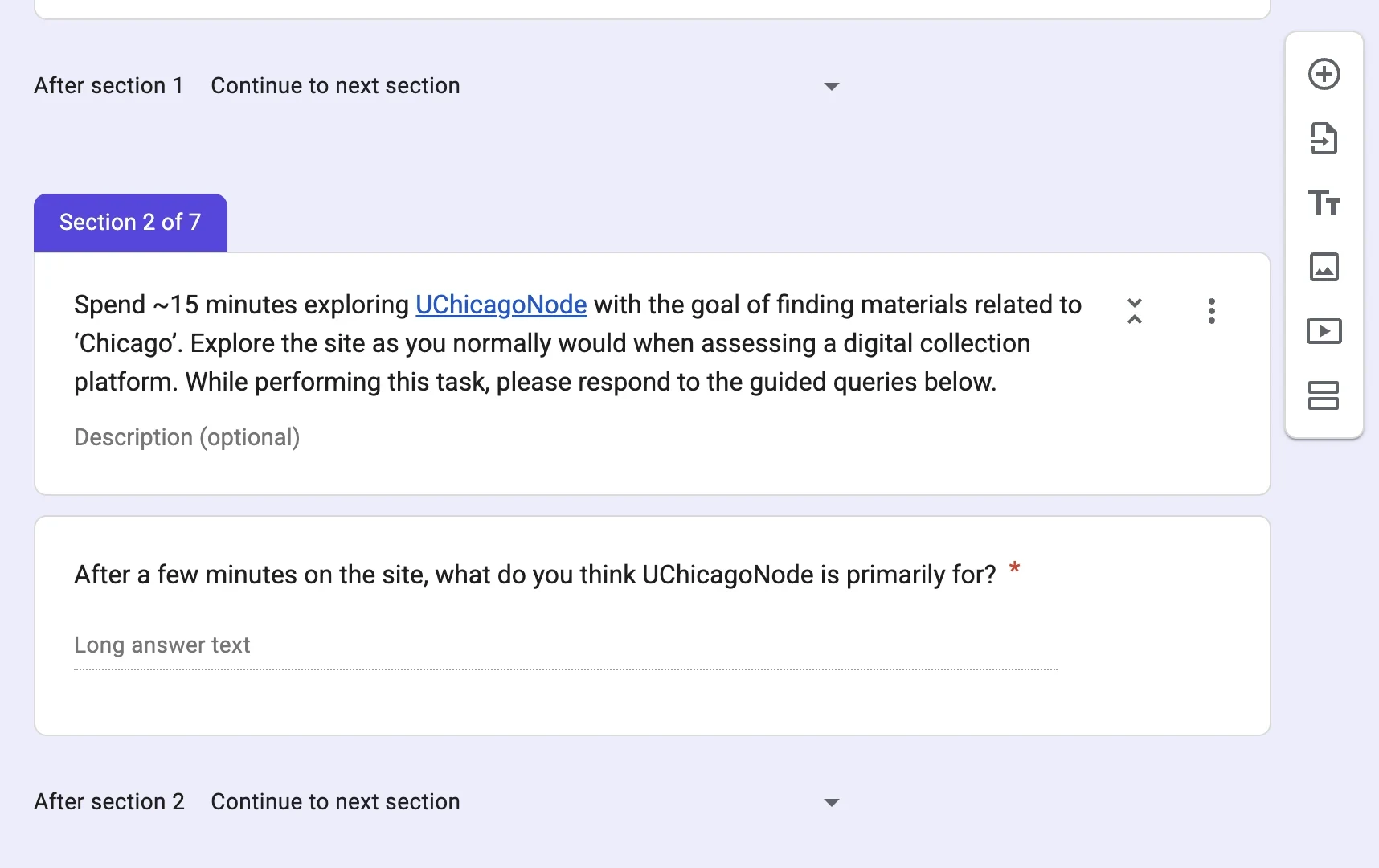
A 7-section Google Form sent to library partners: metadata specialists, GIS librarians, and digital collections managers, undergraduate students: the people who would live in the platform daily.
25+ responses | 2 weeks from design to synthesis | 7 sections
2. what they said.
"With Advanced Search, it was hard to find the 'submit query' button, all the way at the bottom of the page."
— Survey Respondent
"If I search 'Pilsen map' or 'Pilsen AND map', there are 0 results. Individual terms work fine."
— Survey Respondent
"Speed is a real issue — it took 29 seconds to execute a search for 'Chicago.'"
— Survey Respondent
"Is there an explanation for Open Access? Not all users may understand the distinction between open access vs permission to use."
— Survey Respondent
3. synthesis.
10 themes from FigJam affinity mapping.
4. action plan.
every issue was tagged by priority, owner, and evidence from people.
Issues prioritised as CRITICAL / HIGH / MEDIUM, owned by Design / Dev / Metadata.
Add on: Before the action plan, anyone with Hive access could add issues directly — duplicates and vague tickets piled up. Along with the PM, I created a structured intake form that replaced open board access, so that every task was reviewed and assigned appropriately.
Redesign:
One of the main issues from the survey was the advanced search page, which was the first design task I set out to tackle.
I went through multiple design iterations, went through feedback loops, used AI as my design partner and finally delivered an interactive HTML prototype to the developers. Figma for visual specs; HTML as the reference for behaviour.
what changed, and why.
01
Sticky submit bar.
- Submit button was buried below all filters: users scrolled past every filter to reach it.
- No visibility of result count before clicking: users hit zero-result dead ends and restarted from scratch.
- New design: Submit pinned to the viewport with a live result count beside it.
"With Advanced Search, it was hard to find the 'submit query' button, all the way at the bottom of the page."
— Survey Respondent
02
What does "Fuzzy Match" even mean?
Boolean operators and fuzzy/exact dropdowns confused most users. Replaced with plain-language options and an inline tip.
"Wait, what does fuzzy match mean? I have never seen that before."
— Survey respondent
03
Diacritics and casing shouldn't break search.
'sebah' and 'Sébah' returned different results. Fixed so search works the way people naturally type.
"'sebah' and 'Sébah' return different results. Exact match is case-sensitive unexpectedly."
— Survey respondent
04
Open Access as a toggle, with context.
Three unlabelled radio buttons → one toggle, with a tooltip explaining what "Open Access" means on Node.
"Is there an explanation on the site for 'Open Access?' Not all users may understand the distinction."
— Survey Respondent
05
Media Type as icon cards.
Flat checkboxes → visual cards. Scannable, selectable, multiple at once.
06
Active filters are always visible.
Selections appear as chips in a sticky bar with a live result count.
07
One decision at a time.
Embedded checkbox lists were easy to accidentally scroll past. Filters now collapse into accordions — one open at a time.
08
A search guide is also in the works — an inline reference for field options and query patterns.
Accessibility:
Accessibility for UChicagoNode was never an afterthought.
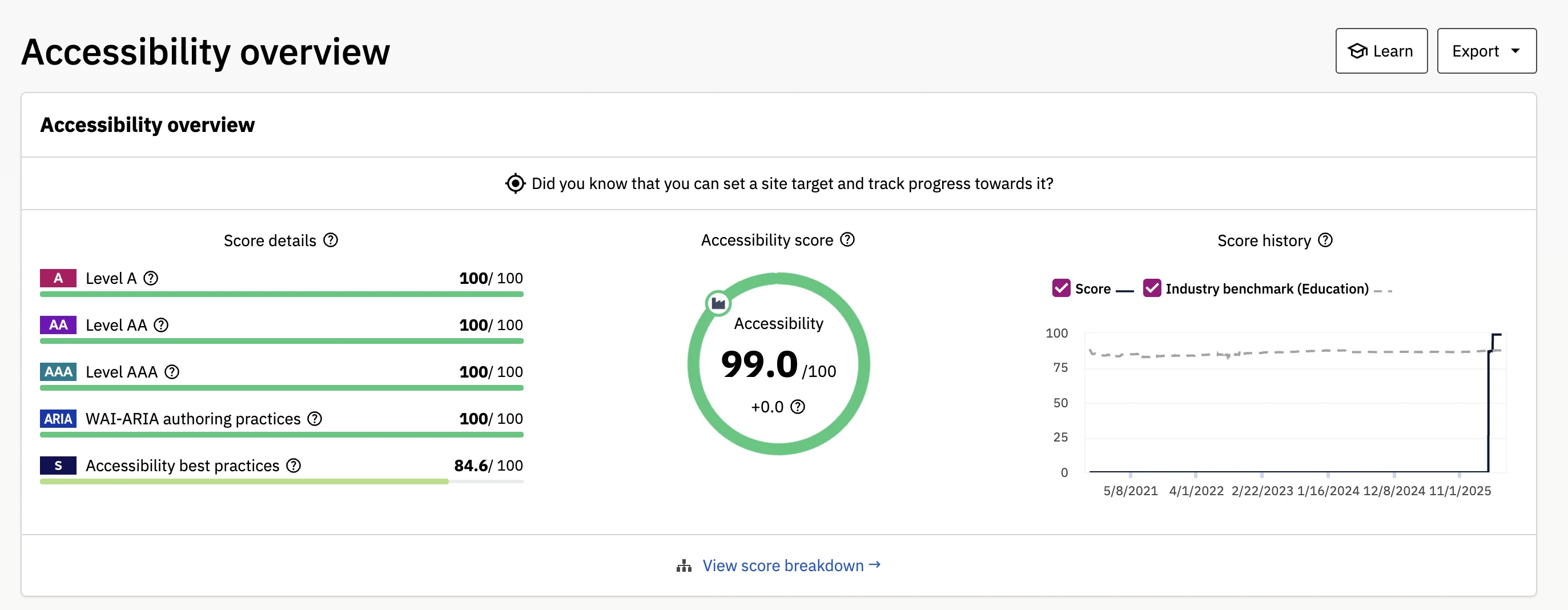
We collaborated with UChicago's Center for Digital Accessibility and reviewed the platform for screen reader compatibility, keyboard navigation, responsiveness and color contrast.
99/100 Siteimprove Score | 100/100 Level A · AA · AAA · WAI-ARIA | 84.6 Best Practices
Learnings: